Translate

Saturday, March 21, 2015

Working in a limited palette


I really enjoy the look of a one color portrait. Some of my favorites were ones done in Sepia and Burnt Sienna. They also serve another important purpose. They forced me to be accurate about the values (percentages of light to dark). 

These portraits were done in a class, with live models. 

I had some problems with color before I started working in sepia. Once I understood accurate values, I was able to solve issues with color.  My portraits in color looked like patchwork. I didn't understand how to blend and resolve transitions from light to dark.

It helps to do a value study. I will make one and post later. 


Friday, March 20, 2015

Palettes - from Butcher block to Plastic wells


I started my painting career using butcher blocks. They have no wells at all, so the paint moves freely. It takes some getting used to, but it's a nice palette for a beginner. Just dab paint around the edges, and the surface of the block lets the water move nicely around the pigment.

Here I show two different sizes. I have a variety of projects going at once, and would go back and forth between palettes.  Once the paint is dried, don't discard it. You can just add water at your next session and begin again.

When I started working with students, I introduced them to these palettes, and they found them to be too messy. So I purchased some standard palettes with wells and slanted inserts for the water.


The pigment and water tends to pool up in the middle of the plastic, so I prefer the metal of the butcher palette. However, you need to experiment to see which palette works best for your way of working.


I purchased this Jones Palette two years ago, worked with it for a few months and went back to my butchers block. Now I have cleaned out the palette and am using it for a new painting, one that required me to test several paint samples. 

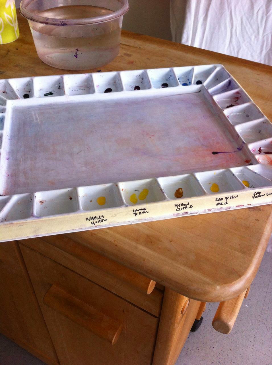
I had originally written the names of the color in permanent ink at the bottom of each well. And pre-filled them with colors I thought I would use. I don't work like that now. 

So I went back to this palette, and cleaned it out. It's easy after it's dry. The try is bendable (be careful, they crack) and you can take a butter knife and ease out the hardened paint.

Here I am lifting off a large chuck on hooker's green. And I proceeded to clean out the rest of the palette the same way.

Then, instead of labeling the wells on the inside (since I will be changing my color palette more frequently) I put masking tape around the edges and labeled from the outside.

There are so many different palettes out there. Sometimes I just use a scrap piece of watercolor paper as a mini palette, then I can test the color as I work. It's great to have many on hand, and see what works best. I'm trying to be more organized, and this example has helped.


Wednesday, March 18, 2015

Watercolor Brushes - my favorites

I tend to reach for the same brush over and over, and that is my number 12 Winsor Newton round. It has an excellent tip.

I have a 14 Kolinsky sable with a long handle that has been very useful, and hold a fair amount of water.

My other favorites are Richeson, synthetic. I've had a few of this brand for almost 20 years. But the 16 has lost it's tip and I am ready to purchase a new one. I still use it for large washes. It's amazing how exciting it can be to purchase a new brush.

The two tiny ones, which are in bad shape, have been used for masking fluid. One is a Cotman brand, the other was a fine sable brush I inherited. Why that ever got near masking fluid is a mystery to me!

I prefer to paint with rounds, always have.

The two on the end I use for water washes. One is a Cotman, the other is an inexpensive Zen brand brush, a brand that is new to me.

Tuesday, March 17, 2015

The watercolor paints I use the most

I've tried many different brands over the years. I started with Cotman (the Winsor Newton student brand) and other store brands, such as Utrecht.

But now I've found my favorites.

Holbein
Daniel Smith
Winsor Newton

Cadmium Red
Alizarin Crimson
Quinacridone Magenta
Phthalo Blue
French Ultramarine
Cerulean Blue
Hooker's Green
Olive Green
Naples Yellow (my latest purchase for a new portrait - seems softer than both Cad yellow and Ochre)
Cad Medium Yellow
Yellow Ochre
Quinadricone Purple
Mineral Violet
Burnt Sienna
Sepia
Payne's Grey                      


This palette has evolved over many years. Now that I've been painting portraits, I've been honing different flesh tones and hair color, so I am always mixing new colors.

Each brand acts a bit differently. Windsor newton tends to be a bit grainy, at least I find it to be in Sepia. And it's necessary to mix out the grains before it hits the paper.

Daniel Smith has a lovely texture, and Holbein has become my new favorite.

My next post will be brushes and palettes.


Inspiration for Self Portrait - Work in Progress

This is a self portrait I just finished for a show entitled "What's New" at the Peninsula Museum of Art in Burlingame, California. I typically portray my subjects from the shoulders up, and wanted to try another style. I had been looking at many different artists to get inspiration. I decided to use inspiration from books I had been reading. The portrait is called "Sophie" and is my interpretation of a character in the Patrick O'Brian books about Jack Aubrey and Stephen Maturin. It is Sophie waiting for Jack to come home.

My first step was to lay down a light wash.
I really liked the initial wash, and wish I could have put down the darkest values at this point. The hair and the face have a nice quality.


I wanted to get the feeling of the breeze coming through the window, and get a hint of my hand showing through.

This is pretty close to the finished product. I always take work in progress photos. It really helps to show my the mistakes, where I should have left an area alone, or increased a value. This piece is for sale in my studio. What do you use for inspiration? I would like to hear your comments.


Saturday, March 14, 2015

What is Grisaille? Underpainting in Watercolor.

Grisaille is a method I stumbled upon while painting this portrait of John. I started by painting the first layer in sepia. That is, the whole painting, the correct values, in sepia. Then I let it completely dry and layered in alizarin crimson, yellow ochre, and pthalo blue for the shadow areas.

Grisaille is a technique used by the old masters. "Gris" means grey. The underpainting, or drawing, can be grey or any neutral color.


Monday, July 7, 2014

Creating a Self Portrait from a photo reference

At some time, you may find you will be asked to create a self-portrait. These are the suggestions I usually give to people if they are going to work from a photo reference.

1. Set up the portrait session as though you were going to paint someone else. Look at it from an objective point of view.

2. Have someone take a new photograph of you. It's tempting to want to use your favorite photo from a past event. I know, I was 20 pounds lighter some years ago and high school photos looked pretty tempting to me. However, this is your chance to create something new.

3. Take special care and consideration with the lighting and the environment around you.

4. Review the first set of photos with your photographer (in my case, my husband). Will any of them work for you? If not, make some changes.

This self-portrait was created four years ago, in watercolor. I had the photo taken in my living room and I liked the look of the drapes. I chose to be photographed with the book because reading is very important to me.

Why am I looking off and down to the bottom right? Because that gave my jaw the most flattering angle.

I plan to do another self-portrait by the end of the year. I'll be sure to post it!